Overview
Once logged into the the Zift PRM application, you have access to Advanced Reporting. With Advanced Reporting you see a complete picture of your channel and partner data in a single view. You no longer need to manually extract data or go to your report guru. You can view, manage your data, and generate reports quickly using the powerful Zift PRM Advanced Reporting feature.
In the views, you will find different visual tools used to improve understanding of the data. Each of the visualizations are described below.
Visualizations
Use this chart to help to determine which visualization is best for your data.
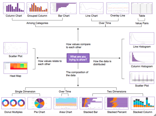
You have many ways of presenting the data. You can choose from Column and Bar Charts, Line and Area Charts, Dual-Axis Charts, and Pie and Donut Charts.
Column and Bar Charts
Column and bar charts are used to show a comparison among different items.
- The measure axis should typically start at 0 to avoid misleading viewers.
- Use horizontal labels whenever possible to ensure that they are readable.
- Consider using a bar chart over a column chart when dimension axis labels are long.
- Choose a bar chart over a column chart when displaying negative values.
- Choose a column chart when comparing values over time.
Line and Area Charts
Line charts are best for depicting trends or progress over time.
- Utilize line charts for comparing measures or dimensions to each other.
- Utilize area charts for showing cumulative values.
- Choose stacked area charts for visualizing how different components contribute to the overall trend (avoid stacking line charts, as this is easy to misinterpret).
- Avoid plotting too many lines or categories at once (5 or fewer is best).
- When possible, it’s best to start the y-axis at 0 to ensure no misinterpretation of the data.
Dual-Axis Charts
Dual-axis charts are best for visualizing relationships between different measures when the scale of each is vastly different (i.e. values and percentages).
- Combine different mark styles (such as a line and a bar) to clearly illustrate each measure.
- Use contrasting colors for each measure to further clarify which is which.
- Place the primary measure on the left-side y-axis, as people tend to look to the left first (similar to how they would read).
Pie and Doughnut Charts
Pie and doughnut charts should be used to visualize a part to whole relationship.
- Make sure that the total sum of all segments equals 100 percent.
- Include fewer than 5 categories in the pie or doughnut chart whenever possible.
- Pie and doughnut charts should not be used for comparing individual sections to each other or for representing exact values.
- Avoid pie and doughnut charts whenever possible, as differences in angles and areas can be difficult for the brain to detect.
Comments
0 comments
Please sign in to leave a comment.